In my Design Thinking, Product Innovation/Strategy and User Centered Product Design workshops, the first activity of the day is to fill out the canvas in order to lay out the key product hypothesis. These hypothesis are the starting point for the problem/solution and product/market fit validation stages.
In other words, I use the Canvas for product design purposes, not as a business plan or as a product pitch.
And since the point of filling out the canvas is to Get Out Of the Building and start talking to users in order to validate product hypothesis, the information entered on the canvas needed to be actionable and written from a user perspective, not from a product or business point of view.
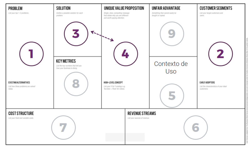
For this activity I used to use the Lean Canvas and I only asked participants to fill 4 out of the 9 boxes (problem, segments, solution, unique value proposition).
However, I found that time and again, attendees asked the same questions around the same business areas of the canvas.
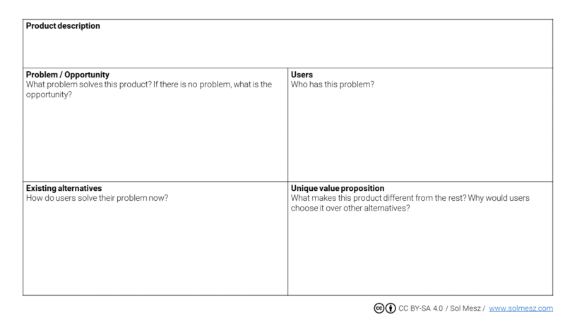
So I came up with the Minicanvas, which is an adaptation from Ash Maurya’s Lean Canvas, and introduces three key changes:
- I only kept the core product areas: Problem, Segments, Solution, Unique value proposition
- Rearranged and renamed some of the areas to help users improve the quality of the information and thus improving results
- Made “Existing Alternatives” more relevant because understanding how users solve the problem is key for the design process and for understanding the key value proposition.
These changes proved to have direct impact on the quality of the information users entered, which in turn improved the validation process and ultimately, the quality of the resulting product.
The 4 core product areas
I only ask participants to concentrate on Problem, Segments, Solution and Unique Value Proposition because these are the core of the product and need to be validated before thinking about the other 5 (Unfair advantage, Channels, Key metrics, Cost structure, Revenue streams).
Therefore, before validating the first four, there is no point in spending time on the rest. Conversely, there is no point in validating the 5 secondary areas if you don’t have the first 4 validated because you may be optimizing for something that won’t work: there is no point in thinking about Revenue Streams if I don’t know if I have the right product.
From the Lean Canvas to the Minicanvas
So, given that I use the canvas for user centered product design, and that I need product hypothesis written from a user perspective, I made four key changes to the Lean Canvas so participants could write better product hypothesis.
#1 Replaced CUSTOMER SEGMENTS for USERS
When you use technical terms, users feel that they needed to get technical too, so they wrote “female, university degree, with an annual income between …” instead of a more organic definition of the segments.
When I changed “Customer Segments” for “Users”, which is a less technical word, participants started using a more qualitative description of the users such as “those who like to keep plants indoor” or “people who like exotic fruits”.
And this description gave participants a better starting point for validating the potential users of their product.
#2 Added OPPORTUNITY to the PROBLEM box
Not all products stem from a problem. Sometimes entrepreneurs or companies see an opportunity and they create a product from it.
When the box was called “Problem”, participants who had products that were born out of an opportunity didn’t know what to enter here and started making problems up. So adding opportunity in this quadrant helped users fill our this box with better quality content which, again, had a direct impact on the outcome of the exercise.
#3 Replaced SOLUTION with PRODUCT DESCRIPTION
When filling out the Solution box, most participants entered the benefit, sales pitch or, in some occasions, a technical description of the product.
What I really needed here was for them to describe their product as if they were explaining it to a friend. So replacing “Solution” for “Product Description” helped users enter a better product description.
#4 EXISTING ALTERNATIVES
In the Lean Canvas, Existing Alternatives is nested inside the Problem box. However, I gave it a box of its own in order to stress its importance.
You can’t design a product if you don’t know how users are solving their problem right now:
- Existing Alternatives are your direct competition, and
- your Unique Value Proposition stems directly from getting a thorough understanding of the current alternatives.
#5 UNIQUE VALUE PROPOSITION
This is the only area that I kept unchanged. I just improved a little the description, to help users better understand what needed to go here.
Conclusion
- I came up with the Minicanvas in order to improve the process of designing User Centered products.
- The Minicanvas is a reduction of the Lean Canvas and was created to focus on the core components of the product.
- The quality of the tools you use to define the product hypothesis, determines the quality of the information you get. So using the right tools is key to getting quality information. If users don’t understand what information they need to fill out, they’ll just comply with the task mechanically instead of entering quality information.
- Obtaining quality information is key for the outcome of the exercise. So the better the quality, the better the results. And better results in this case, equals better products.
- Using business or technical terms, elicit business or technical responses. So if you’re using the canvas to for user centered design, it is best to complete it with user centered descriptions. This is the first step in trying to understand and empathize with your users. Using business/technical terms, will result in a business/technical view.


